The Challenge
The Information Commissioner play an important role in the digital ecology of the UK, dealing with both Data Protection and Freedom of Information requests. Their site had grown organically since it first launched in 2007, but like an untended garden it had become overgrown and difficult to negotiate. Some paths through it were well trodden, if meandering, others overgrown and obscured. In 2014, as part of Fluent Interaction, I worked on restructuring and relaunching the site.
Approach
User Research
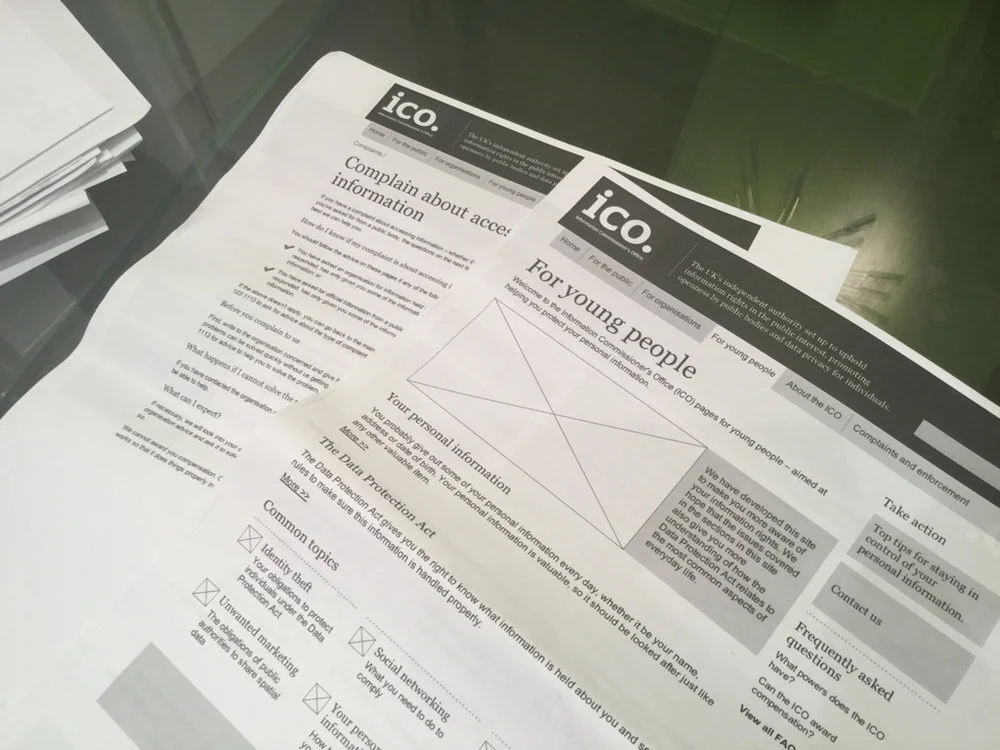
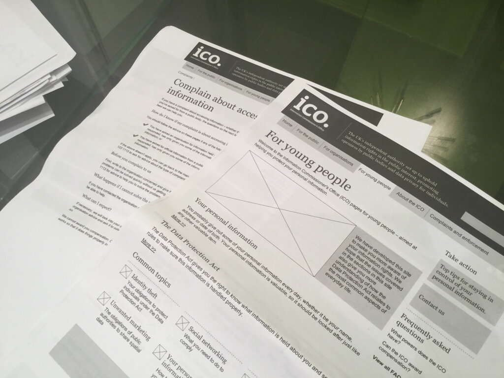
Initial research showed that users felt the site labyrinthine, and because information was diffused throughout it and pages looped back on one another or was repeated elsewhere, they were left with an uneasy feeling that they had missed something.
Some important information, such as the principles of data protection, were buried six layers deep. And because there was a vast amount of information that needed to be there, it became clear early on that robust information architecture was central to the success of the site.
Information Architecture
During the heuristic evaluation of the existing site I also embarked on a substantial research phase in which I digested a significant amount of the site content, including much in the way of PDFs. We then conducted a series of workshops out of which came a set of user stories ranked by importance. Armed with this information, I set about mapping a number of options for site and page level architecture, keeping in mind that it had to serve the general public, but also a small and quite vocal group of hardcore Freedom of Information enthusiasts and data controllers.
Further workshops iterated and then validated our decisions, and in conjunction with development partners, we then narrowed in on the page structures and catalogued each functional component, which too was ranked in order of importance.

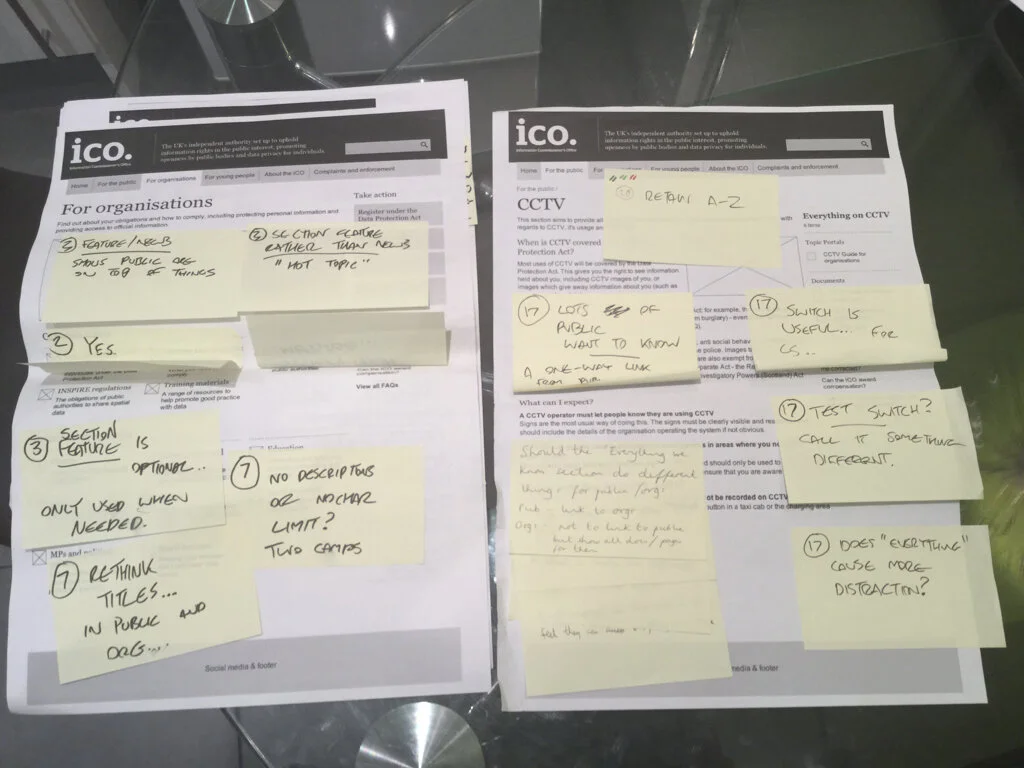


Prototyping and Testing

With the site structure crystallising, each iteration of the interactive prototype - informed by user testing - added more and more fine-grain resolution and attention to detail, such as micro-interactions and micro-copy. Clarity of navigation and information quality was of primary importance to the site, and this vetoed any design pretensions. However that did not mean there was no room for innovation. One particular challenge was how to present and query large documents that had once been PDFs; our solution was the "mutli-page document" which allowed users to zero-in on information quickly and effectively and deep link to relevant segments.
Outcome
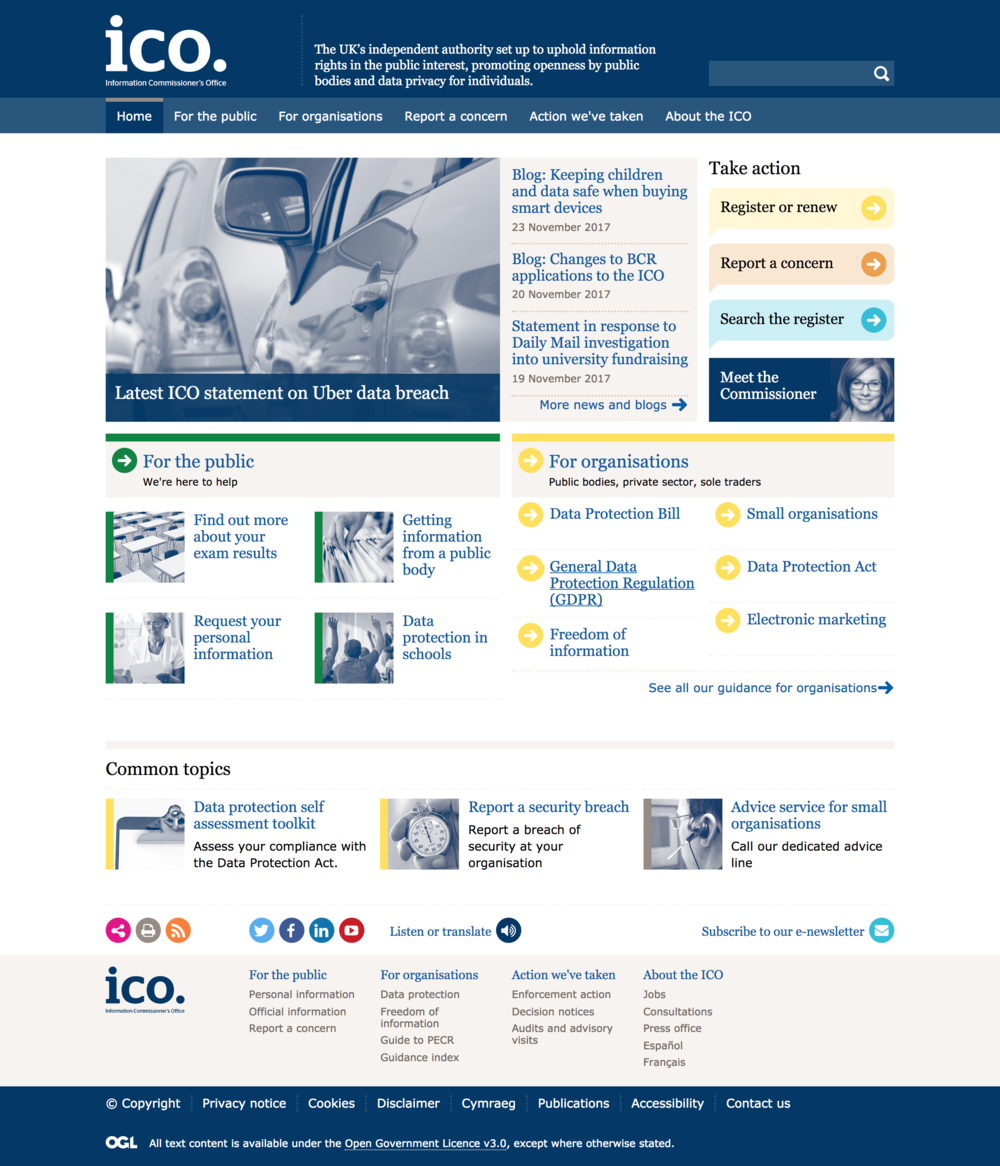
Since launch, the ICO have been approached by a number of organisations worldwide who see their new website as the model they want to emulate.
Greer Schick, the ICO's Online and Internal Communications Manager said "I was impressed with Fluent. Understanding the needs of our users and our organisation was fundamental to their approach. This meant that all of their advice, ideas and designs were relevant for us and our users. That, plus their support for our agile approach, really helped make the project a success."
As well as serving the general public, the ICO has a small but highly dedicated fanbase. Freedom of Information blogger "FOI Man" was cautious of the update, hearing that we were using Gov.uk principles, but was pleasantly surprised.
"I’m pleased that by retaining features like the guidance index, they’ve found ways to cater for those of us old hands who were used to finding information in a particular way, whilst providing a helpful step-by-step approach for new users. The gov.uk site could certainly learn a thing or two from this – trying to make digital services accessible to new groups is a noble aim, but the needs of existing users of online resources should be taken into account as well."