The Challenge
In the coming decade the Imperial War Museums intends to reorient the organization to put customer experience at the very centre and foster a dynamic and entrepreneurial culture. In order to achieve this, they asked Inviqa to create the foundations of an expansive customer service improvement framework. Through a series of workshops with senior staff, we would look to build up a service blueprint of the current customer experience before transforming this to a future vision of the ideal CX that can be measured and quantified, and ultimately validated with customers.
Users and audience
On starting the project we were supplied marketing segments rather than personas, they did provide a broad outline of who current visitors are and who they aspired to attract.
Roles and responsibilities
Workshops would be co-led by Nicholas Weber and myself, while the thinking, service blueprints and other deliverables would be created by myself. Project overseen by Mike Brooks.
Scope and constraints
This project had an extremely tight budget of just under £20k. At first it was planned to map this for all five museums simultaneously, but we quickly realised that they were each so unique that it would not be possible within the timelines, so we pivoted to focus on a pilot project in IWM London before expanding it out to all to the other museums. A further issue was the availability of senior staff and getting calendars aligned, to minimise dropouts. Because time was in limited supply, conducting smaller one-on-one interviews was not appropriate.
Approach
Desk Research
The first few days were an intensive deep dive into previous research, personas, corporate plans and strategy documents in order to be able to have informed conversations with the stakeholders. This was not billed to the client. This was then compiled into a single deck to make future onboarding of other consultants more streamlined.


Service Blueprint
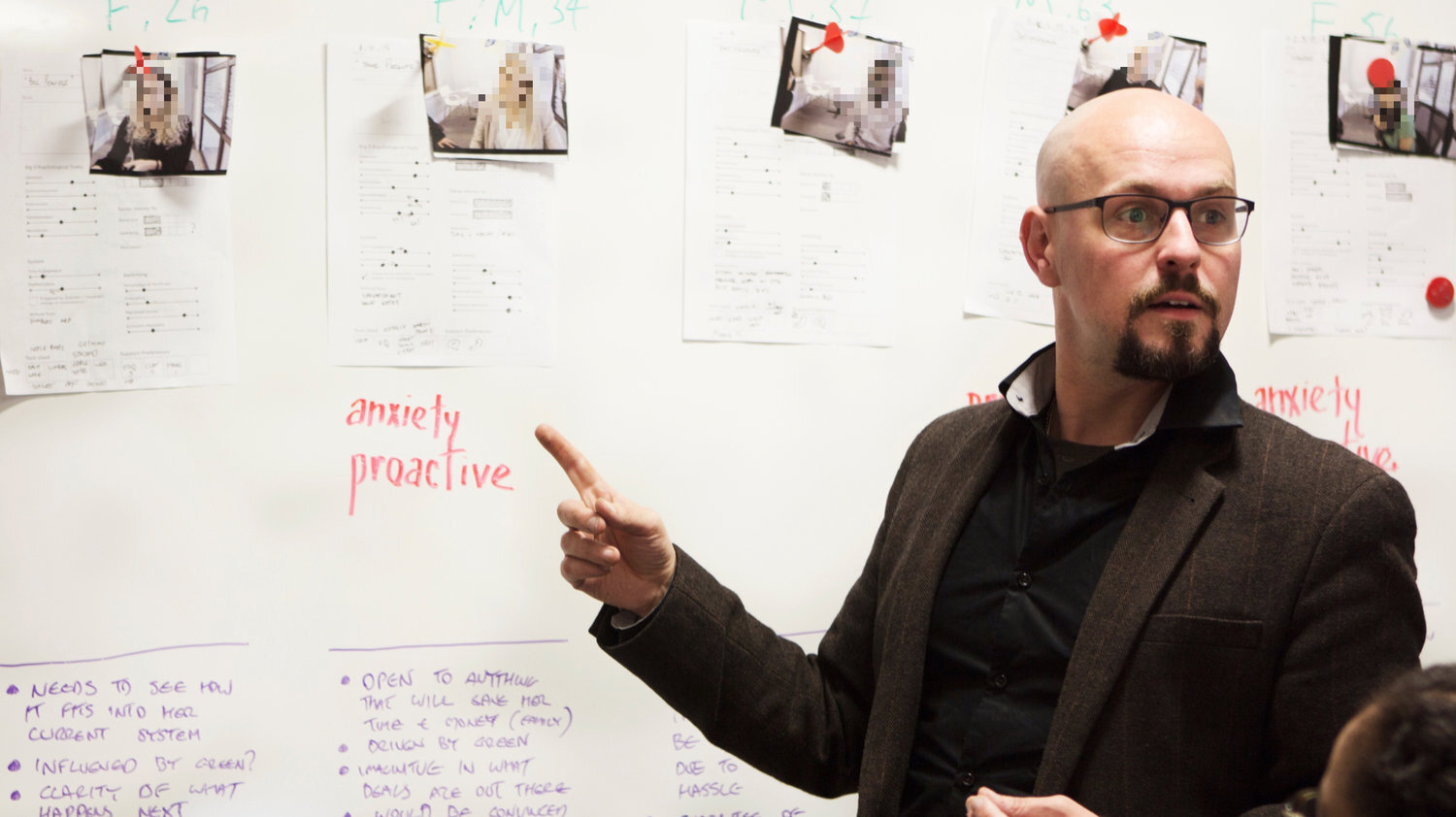
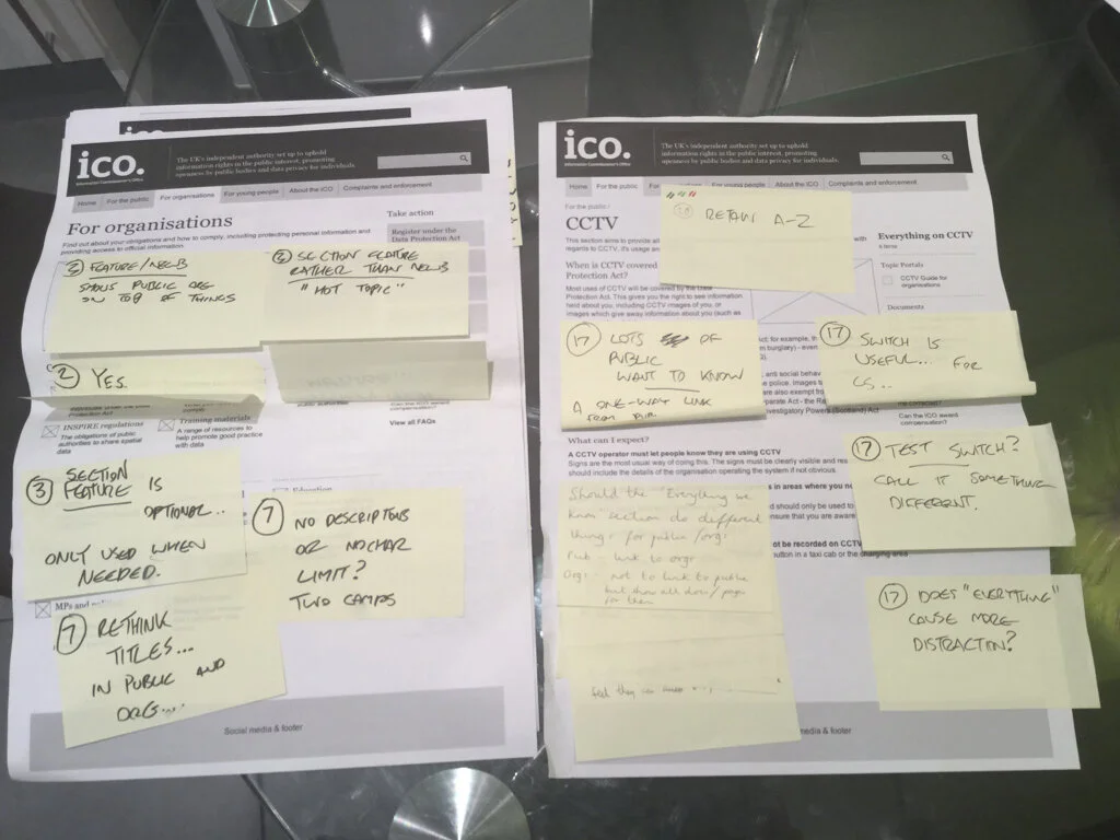
While these took some time to arrange due to aforementioned availability and scheduling issues, these initial workshops proved to be valuable in terms of collecting the various elements of the customer experience and different department’s KPIs, metrics, initiatives and plans at each stage. In the final of these workshops, held in the dome of IWM London, we presented back the unified vision for verification by key customer-facing stakeholders from across the business. In this revised blueprint, we broke down the customer experience into three broad channels; human, digital and physical, and summarised with quotes aligned to different audience groups.


Metrics and Opportunities Map
Having learned a significant amount about the current and desired customer experience, we then followed up our discussion with department heads responsible for backstage operations - such as planning exhibitions. We learned so much during our final workshop that decided to split the Service Blueprint into a second map, where we logged everything that was currently being measured, customer moments, and all of the operational issues that were standing in the way of delivering our ideal customer experience.
This exercise was useful as it allowed us to identify gaps and redundancies in current metrics, as well as identify sources of methodological bias. In approaching the problem from the perspective of systems thinking, we also identified a number of recommendations for service delivery improvements and how to think about customer experience in a more holistic fashion, that were beyond the scope of the work but logged for future investigation. These included;
Operational and workflow recommendations
Changes in the way volunteers are deployed
Opportunities for developing the new membership offering
An appetite for co-creation of future exhibitions with the public
One of the other key issues with the current setup was the existence of competing KPIs, especially around the main entrance, which gave rise to a sense of disorientation and confusion at the start of the visit.
Measuring the Customer Experience
Having mapped all of the systemic issues and current measurements, we needed to find a way to address what really mattered to customers. One notable gap in how information was gathered is that there was no way of gauging the customer experience in the moment that was not subject to some kind of bias.
During the course of the project I explored much in the way of customer experience measurement literature during the course of this project, and it became clear that although many organisations were attempting to measure customer experience in a variety of ways, few of them felt they were doing a splendid job. On the other hand, some of the off-the-shelf frameworks as outlined in books were self-satisfied in their baroque complexity and comprehensiveness, but were in reality totally impractical to implement. The puzzle then, was finding a system that would sit in the Goldilocks zone between easy-to-implement and manage also be empirically meaningful and provide actionable information.
The interviews with volunteers, customer service reps and other frontline staff, combined with a close reading of complaints data and feedback on Tripadviser, allowed us to get a good feel for what really mattered to people. While there are a core group of visitors who are invested in the more intellectual aspects of the museum, many others just want a pleasant day out; “a view, a brew and a loo”. So measuring the quality of the cafe and the loos with a Customer Satisfaction (CSAT) score was essential. Then there was way-finding. A number of issues had conspired in the London site to mean physical locating the museum and finding things to see inside were more frustrating that they ought to be. This was an open secret to front-line staff, but the knowledge of the problem were diffuse, unmeasured and near-invisible at a board level. Here, a Customer Effort Score (CES) was appropriate. But these were all just hygiene factors.
Two “big bucket”: categories then made themselves immediately obvious;
1: Wayfinding & Orientation
2: The Service Experience
However more vexing issue was how to accurately and meaningfully measure people’s visit beyond simple hygiene factors.
Firstly, what do we even mean when we talk about experience? Early in our workshops, we came up with the following definition; “the customer’s perception of the sum of all interactions between themselves and Imperial War Museums, across every touchpoint for the entire lifecycle of our relationship.” Expansive stuff, but how to turn that into something measurable or useful?
The Psychology of Experience
In Daniel Kanheman’s landmark book Thinking Fast and Slow, he popularises the idea of the two selves. First, the experiencing self which is entangled in the teenage now mentally and emotionally; it is the you that is reading this case study. Then there is the remembering self, which is the you that constructs a narrative out of what your read from the “peaks” and end of the experience. While this might seem obvious, his research also showed that our memory of an experience can differ quite drastically from our experience in the moment. In our context, one’s museum visit can be considered 95% boring by experiencing self but is recalled fondly by the remembering self if there is a single moment of fission which makes a powerful emotional connection. Conversely, for instance, an otherwise enjoyable day out at the IWM can be spoiled by failing to find the loos in time of need, or feeling ripped off at the cafe. Over time, these “peak” experiences, characterised by high affective quality, become the only thing you remember in the future. Those other memories, deemed unworthy by your by the calorie conscious neural circuitry, fade into oblivion.
The final aspect of this is expectation, which provides the mental context of the experiencing self. Cognitively speaking they are anticipations of future memories and we of course feel short-changed if they turn out to disappoint us. If what the visitor has seen online, in a poster or in a review differs substantially from what is experienced in the moment, the chances of a cranky review on TripAdvisor increase.
What this means in practice for us, is attempting to gauge, gingerly, how a visitor’s experience drifts over time. As such, our plan involves a quick on-site survey, incentivised and conducted on their own a mobile device, to capture as best we can the immediacy of what the experiencing self thinks and feels by asking them first if their expectation were met, then to rate the experience on a scale between forgettable and unforgettable (the “peak” experience), with the option to provide written details. Then, via the magic of CRM, we ask them again in six months to a year later to do the same, asking what they remember most. By comparing this qualitative and quantitative data, and if we can collect enough data, in theory we should be able to see what elements of the experience were most powerful, good and bad, and how this might have drifted over time.
Taking this all into account, it made sense to split our core experience into three chronologically distinct segments; expectations, whether meaningful connection “peak” experience had been achieved, and the remembered experience. These three elements were combined with the NPS to constitute our “core” experience and constitute the third pillar of our CX Score.
The Customer Experience Score

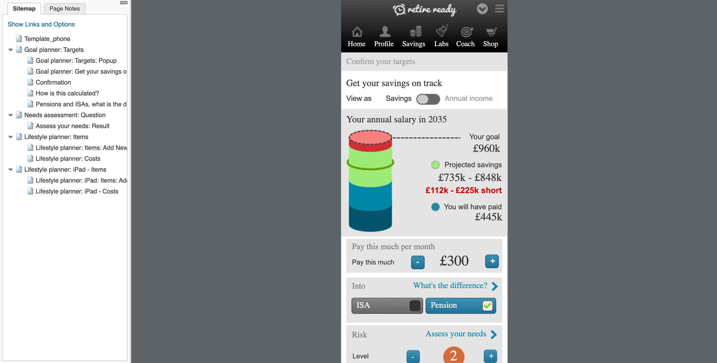
My mockup of the final score
Having identified the important elements of the score, I mocked up what, in the future, it look like, but we still needed to ask the right questions in order to fill in the unknowns. Using our maps, we identified what we needed to be asking and when, and collected for each of these corresponding metrics (i.e. on-site membership signups to compare to meaningful connections) and also corresponding issues that needed to be addressed.
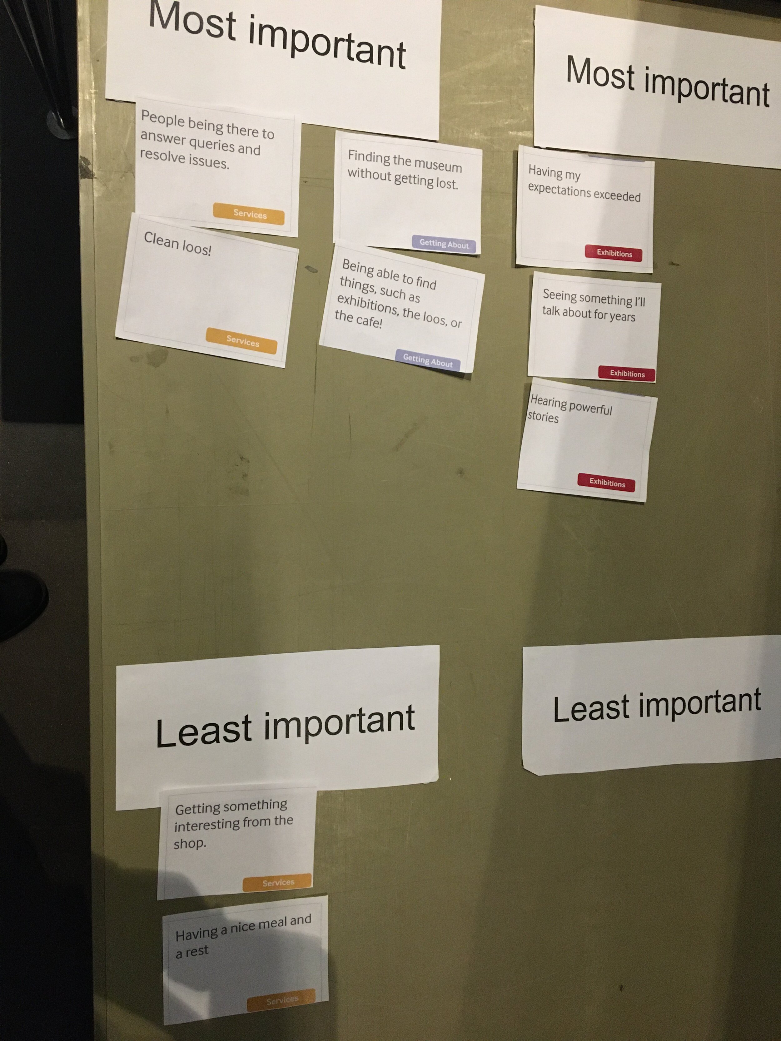
We then needed to determine how important each of segments was to the total score, and so in order to find out these weightings, I asked customer service staff at IWM to carry out a card-sorting exercise to rank each element of the score in terms of importance. This then became the initial weightings of the score, from a customer perspective.


Outcome
On 3 January 2020, IWM London launched an incentivised on-site survey to collect the missing elements of the CX Score. This pilot project will run until March and will help both test the concept and set baseline metrics from which to develop. Also as of 2020, the IWM is engaged in an internal restructuring, and as part of this each museum will have a Head of Customer Experience, which will be gauged and incentivised using the new CX score. This will in time replace the current existing situation we uncovered, where different department have competing KPIs.