The Challenge
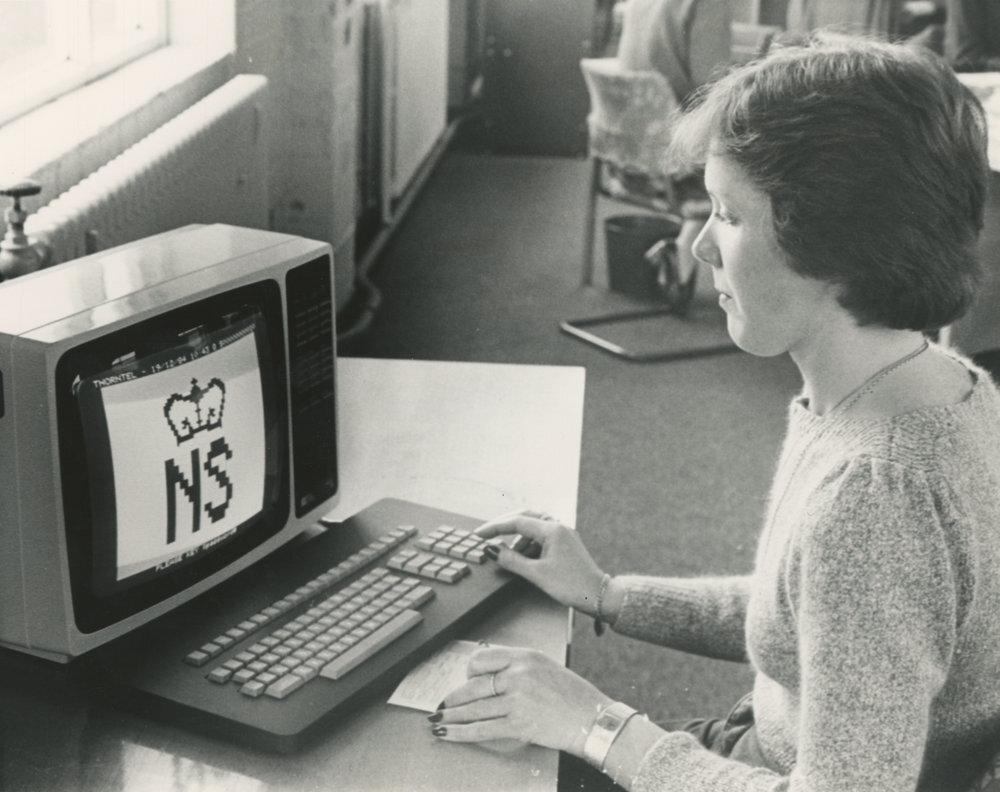
NS&I are a British Institution dating back to the 1860s, but have had a tough time modernising their service and public image to reflect the modern financial marketplace. Having refreshed much else of their digital estate, their corporate site still looked dated and was not fully serving key audiences and the public. Its information architecture was suffering from an encroachment of marketing jargon and its content was out-of-date, stale and miscellaneous.
With this in mind, I sat out to construct a site that was at once both modern and innovative but mindful of its rich and fascinating past.
The Approach
Stakeholder Interviews and Research
The first two months of the project involved a series of workshops in which I interviewed key stakeholders for each relevant department (Senior Management, Media, HR, and Management etc). Together we mapped out the key audience groups (23 of them in total with nearly 200 user stories), unpacked their various needs and identified what we want them to think, feel and do on the site.
Keen to communicate an innovative history that was fast being forgotten, I spent two weeks exploring NS&I's historic archives, uncovering key episodes in the history of technology, culture and women's rights that could provide fresh interpretations of their past.
Content Strategy & Structure
These exercises flushed out some unresolved political issues within the organisation and divergent goals, but ultimately this helped clarify the purpose of the site and what precisely it was we wanted it and our users to do. We soon refined down our audience groups and user stories substantially and identified new opportunities for content strategy.
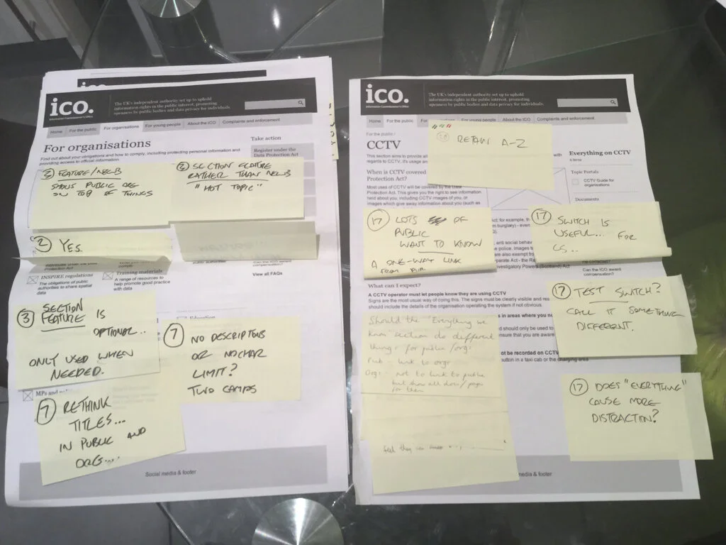
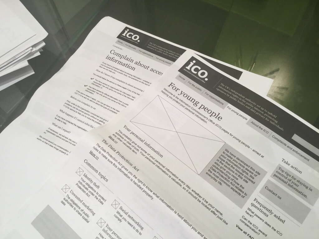
After ranking our stories and clustering them by content theme, I set about organising a number of alternative site structures and page level architectures to discuss with key stakeholders and decide on what we wanted to incorporate into our first interactive prototype and take into user testing. As part of this process, I suggested some more innovative approaches to displaying more difficult content, and new ways to present drier forms of information - such as complaints data and the "net financial target" - to make it more comprehensible to users. I also suggested to amp-up some of the research and reports to make them more media-rich.
User Testing and Refinement
We conducted two rounds of user testing in all, and tested both with representative samples of our key audience groups and some internal stakeholders. We identified a number of stumbling blocks with the site architecture and with nomenclature and taxonomy, and points where content required additional framing copy.
One financial adviser, with amusing and monotone frankness, found it "irrelevant to future performance [of financial products]". It was however a big hit with our general public audience, one of whom found themselves engrossed in the content. “I really respect this type of thing [heritage timeline] and that this is in everybody's reach, it has a sense of people's interests” commented one users. “That they’ve been going for so long is quite reassuring” said another.
The theme of women's rights highlighted in the history also resonated well with the group. We also discovered that financial journalists - one self-admittedly lazy - loved the idea of product factsheets and research filled with graphs and figures that he or she could repurpose for their own blogs and think pieces.
Outcome
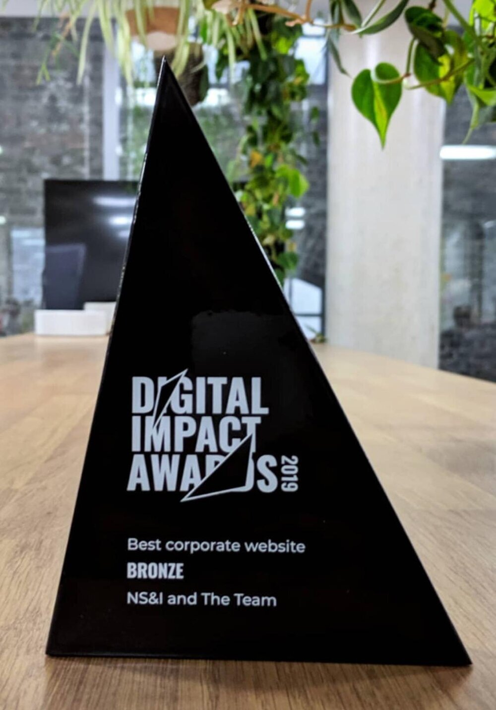
The Corporate Site and timeline launched in 2019 and went on to win a Digital Impact Award. The process we embarked on both clarified the primary user needs in a manner that lets them best allocate resources, and let us discover design patterns that should stem the flow of inbound calls with tactically placed self-service content. It also influenced their future communications strategy by providing new avenues for rich content for multiple audiences - and a whole new website.
It also pushed the boundaries of commitment to transparency - extremely prominent salary information displayed for top management caused some nervousness to senior staff, but went down well with general public as appearing honest and modest compared to what they imagined!
