UX Design

NS&I - Bringing a 19th century company into the 21st

The Challenge

NS&I+Microcomputer.jpg

NS&I are a British Institution dating back to the 1860s, but have had a tough time modernising their service and public image to reflect the modern financial marketplace. Having refreshed much else of their digital estate, their corporate site still looked dated and was not fully serving key audiences and the public. Its information architecture was suffering from an encroachment of marketing jargon and its content was out-of-date, stale and miscellaneous.

With this in mind, I sat out to construct a site that was at once both modern and innovative but mindful of its rich and fascinating past. 


The Approach

Stakeholder Interviews and Research

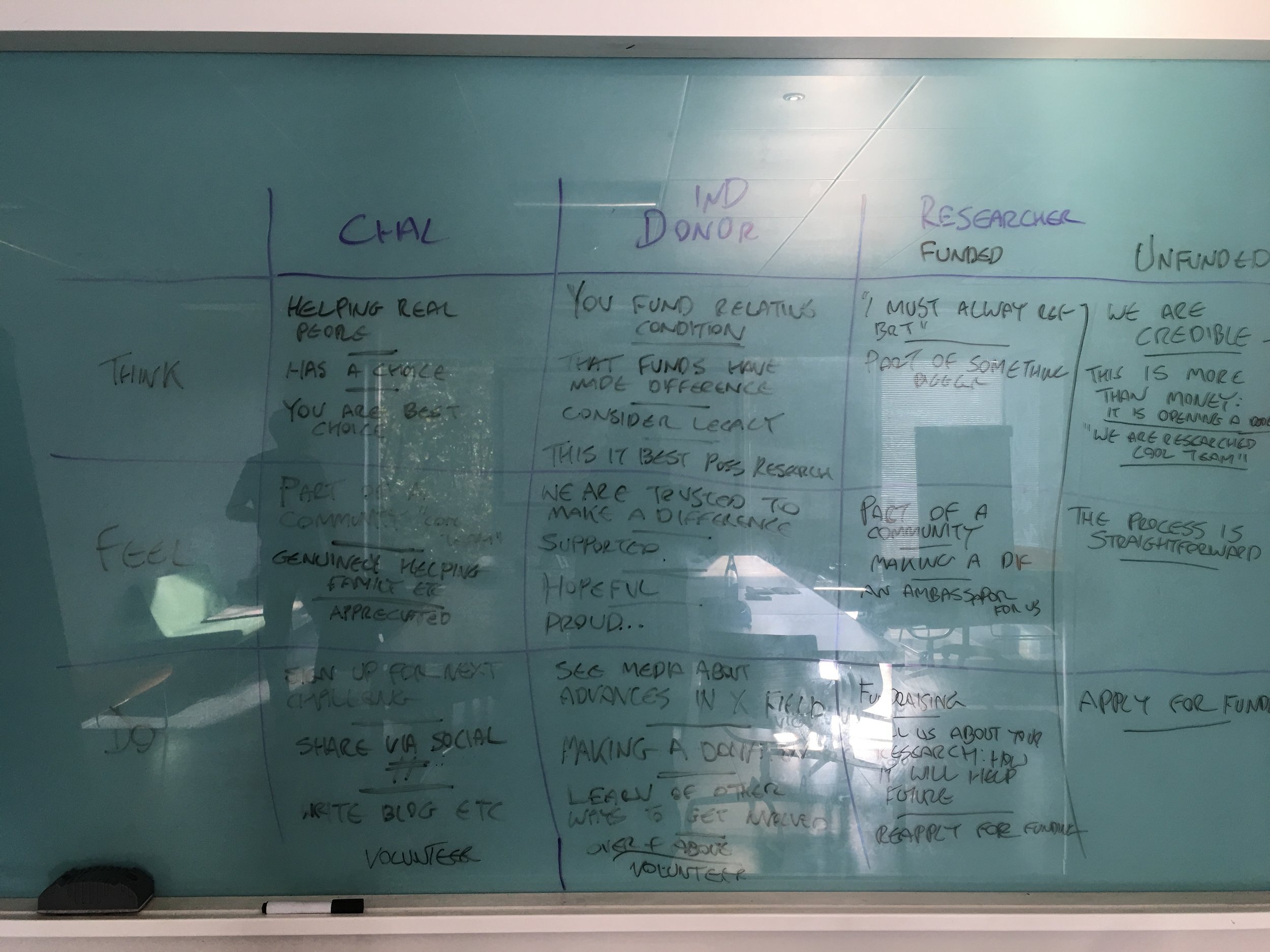
The first two months of the project involved a series of workshops in which I interviewed key stakeholders for each relevant department (Senior Management, Media, HR, and Management etc). Together we mapped out the key audience groups (23 of them in total with nearly 200 user stories), unpacked their various needs and identified what we want them to think, feel and do on the site.

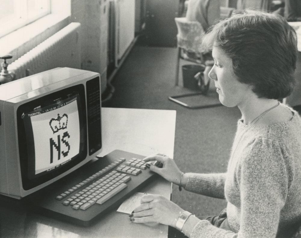
Keen to communicate an innovative history that was fast being forgotten, I spent two weeks exploring NS&I's historic archives, uncovering key episodes in the history of technology, culture and women's rights that could provide fresh interpretations of their past.  

Content Strategy & Structure

These exercises flushed out some unresolved political issues within the organisation and divergent goals, but ultimately this helped clarify the purpose of the site and what precisely it was we wanted it and our users to do. We soon refined down our audience groups and user stories substantially and identified new opportunities for content strategy.

After ranking our stories and clustering them by content theme, I set about organising a number of alternative site structures and page level architectures to discuss with key stakeholders and decide on what we wanted to incorporate into our first interactive prototype and take into user testing. As part of this process, I suggested some more innovative approaches to displaying more difficult content, and new ways to present drier forms of information - such as complaints data and the "net financial target" - to make it more comprehensible to users.  I also suggested to amp-up some of the research and reports to make them more media-rich. 

User Testing and Refinement

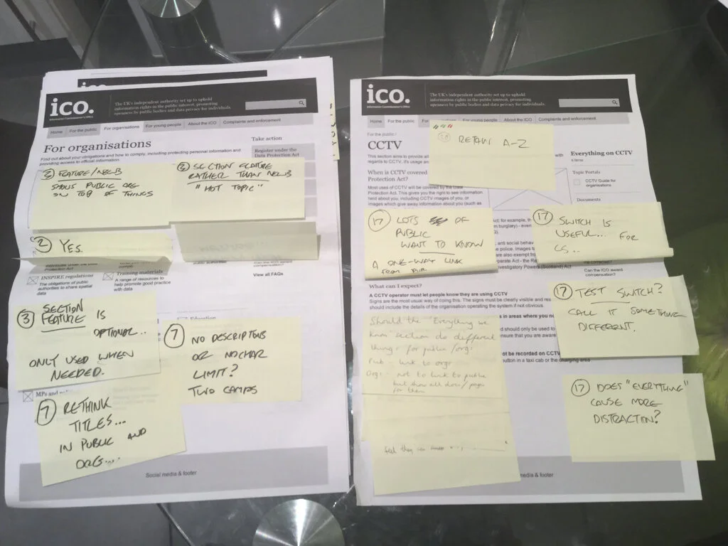
We conducted two rounds of user testing in all, and tested both with representative samples of our key audience groups and some internal stakeholders. We identified a number of stumbling blocks with the site architecture and with nomenclature and taxonomy, and points where content required additional framing copy. 

One financial adviser, with amusing and monotone frankness, found it "irrelevant to future performance [of financial products]". It was however a big hit with our general public audience, one of whom found themselves engrossed in the content. “I really respect this type of thing [heritage timeline] and that this is in everybody's reach, it has a sense of people's interests” commented one users. “That they’ve been going for so long is quite reassuring” said another. 

The theme of women's rights highlighted in the history also resonated well with the group. We also discovered that financial journalists - one self-admittedly lazy - loved the idea of product factsheets and research filled with graphs and figures that he or she could repurpose for their own blogs and think pieces. 


Outcome

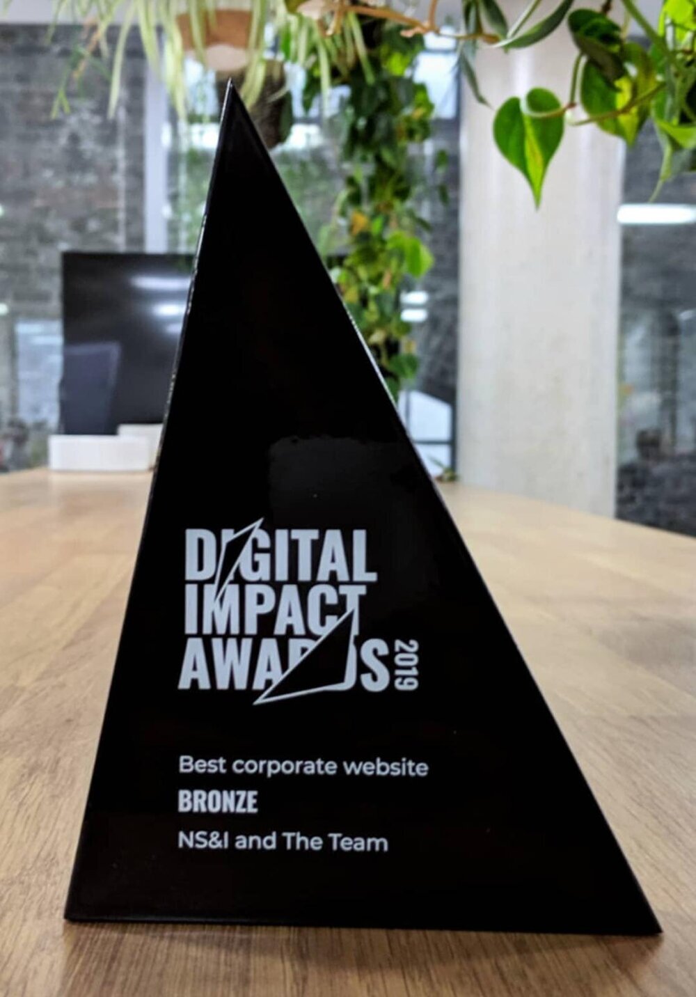
The Corporate Site and timeline launched in 2019 and went on to win a Digital Impact Award. The process we embarked on both clarified the primary user needs in a manner that lets them best allocate resources, and let us discover design patterns that should stem the flow of inbound calls with tactically placed self-service content. It also influenced their future communications strategy by providing new avenues for rich content for multiple audiences - and a whole new website.

It also pushed the boundaries of commitment to transparency - extremely prominent salary information displayed for top management caused some nervousness to senior staff, but went down well with general public as appearing honest and modest compared to what they imagined!  

Digital+Impact+Award.jpeg

Building an effective fundraising platform for the Brain Research Trust

The Challenge

Brain Research Trust

Unlike similar neurological charities (Parkinson’s UK, Alzheimer's Society), the Brain Research Trust are unique in that they potentially fund over 200 brain conditions, but for decades their scope was limited to the UCL Institute of Neurology in London and to studying a comparative handful of illnesses. In 2016 however, they decided to expand the scope of their ambitions to the entire country. To embark on this, they hired The Team to rebrand them  and I was set the task of planning a new, responsive website that would communicate the scale of their ambitions, fulfil the needs of diverse audiences and act as an effective fundraising platform.


Approach

USER STORIES AND JOURNEYS

After cataloging many user stories, we prioritised and identified the most important ones for each group to expand into more detailed user journeys, from first contact to long term engagement. We identified that given the amount of fundraising activity, encouraging live-streaming, for instance, would be of enormous benefit. They also demonstrated to the client the central importance of a newsletter and a robust content strategy in maintaining long term relationships and encouraging repeat donations. 

INFORMATION ARCHITECTURE AND ETHICS

Much discussion was had on the best way to present the breadth of the ailments that would be studied, which raised some ethical issues. Some conditions are very rare and do not have dedicated charities, so at one stage we considered having landing pages for each, aiding SEO. However, because of the nature of how projects are funded, not all conditions were necessarily studied at all times. To complicate matters further, a rarer condition could potentially benefit indirectly from research into another condition! After some deliberation and a number of iterations, we settled on listing out primary conditions, and presenting categories of other types that were being actively funded. 

The psychology of donations

In structuring the donations journey, I studied the current thinking on the psychology of giving and reviewed a great number of competitor sites. I identified a number of methods to encourage users to give higher amounts, and also applying the "peak-end rule" to reward them with videos and messages of thanks at the end of a donation process, and leave them with a positive feeling that their donation is having a tangible impact on people's quality of life. 


Outcome

The rebranding and relaunch of the site was a huge success, resulting in an upsurge of donations and a new approach to content strategy. Caroline Blakely of Brain Research Trust CEO said:

“We briefed The Team to review our brand and to create something that would support and drive our ambitious strategy for growth. Our new look and feel is warm and engaging and brings a human element to our medical research. It gives us the tools we need to progress as a national charity, funding the best neurological research in the UK.”

Creating an Innovation Centre for G4S in just 6 Weeks

The Challenge

G4S's security offerings are expansive and complex, and senior sales staff sometimes had difficulty in communicating both the enormous scope of the offering and the precise selling points of their data-driven approach to security.

As such, we were asked to collaborate on a new experience centre, located in an old bank vault in Westminster, to act as a media-rich sales tool that would help diagnose the needs of high-value prospects across a range of industry sectors and scenarios.

The catch was that we had to deliver it in just six weeks. 


Approach

Understanding the product

My first task was to embark on a series of interviews and research to understand the philosophy behind the client's approach to security, while simultaneously trying to ascertain the needs and concerns of high-value clients. At the same time, we needed to liaise with the architects to ensure that whatever we were going to propose would comfortably fit within the confines of the space. 

Sketching and Ideation

I quickly ascertained that the centrepiece of the innovation suite would be a diagnostics tool, to demonstrate a number of security scenarios in various physical locations in order to prompt discussion as to precisely what their security concerns were. The default settings of the tools were based on further workshops with G4S's security experts, from which I sketched and iterated a number of interface designs. 

Prototyping and Orchestration

After deciding on a final approach that would work within the timeframe, we moved quickly from prototype to development, and I liaised with third party developers, 3d designers, the architects and our own in-house design team to ensure everything ran on schedule. We had successfully designed a four-stage system that moved the prospect from high level concepts to concrete security proposals in the form of a PDF generated at the end of the process. 


Outcome

The client feedback from the Bunker has been extremely positive. While the precise details are confidential, we are told the Bunker has played a role in securing for G4S a number of high value contracts. They are now planning to expand the functionality of the system and they are looking to launch more of them in other cities in Europe and around the world. 

GSMA Mobile Connect - a little button that hides vast complexity

The Challenge

Mobile Connect is a small button that hides a lot of complexity. A challenger to "Login with Facebook" with future ambitions to allow electronic voting, the idea emerged from within the GSMA (which represents more that 800 mobile operators worldwide) and needed a way to communicate not just the user experience, but the more fundamental technological challenges that it posed if it were ever to be a success. 


Approach

Mapping Complexity

The first month of the project was an investigation into the technical complexities of what would happen behind the scenes when a user tapped "log in". We first mapped out all the different devices that would work on; and as it was a global project it had to work in markets that still dominated by feature-phones as well as the most modern devices. We mapped out technical scenarios (was this to post a comment or make a transaction etc) and flow diagrams to illustrate the logic. Soon, we realised the limitations of traditional methods. 

Creating New Tools

We were in a race against time to get a working prototype for the 2014 GSMA World Mobile Congress, and mapping the logic for each of the 155 chosen scenarios using flow diagrams in order to build a working prototype was not an option. I therefore created a new method, a card game that I played with the key stakeholders to rapidly map out each scenario in a fraction of the time. Once they got the knack of how it worked, I created worksheets they could fill in in place of the cards.

Prototyping

As each "card" corresponded to a screen template within Axure, I could now apply the logic to a frontend interface so that engineers could simply enter a few options to see how the login experience should look and function across a huge number of technical scenarios. 


Outcome

We successfully demonstrated the proposed product at the World Mobile Congress and a pilot project was then quickly proposed in Sri Lanka. If anything, the mobile operators were taken aback by the level of detail. "I think we were a little ahead of our time with it at first but once the Operators [were] ready to see that level of detail it is really well received." said product manager Jo Gilbert. Today, Mobile Connect is available to over 2 billion customers

Marketing Programme Director was also happy with the project; "I worked with Jamie on a complex, innovative and far reaching Telecommunications project. His input on the streamlining of the user experience and journey was invaluable. His proposals were well considered, practical and forthcoming, Always the professional, Jamie is organised and approachable, making him very easy to work with. I have no hesitation in recommending Jamie and would be delighted to collaborate with him again."

Encouraging people to save for retirement with Retiready

The Challenge

Founded in 1831 as Scottish Equitable, Aegon has been a provider of Insurance and savings products for nearly two centuries. But in all this time, they were sold to other businesses in the form of workplace pensions and investments. Then, in 2013, Aegon MD David Macmillan hired UX agency Fluent Interaction and proposition design consultancy Market Gravity to explore ways to sell pensions directly to consumers.

This was borne out of a crisis revealed in data. Far too few people were saving and had no idea how paltry a state pension would be. David was evangelical that we needed to reach people directly in order to address the problem.

David Macmillan, Aegon MD

We used three words in the organisation to communicate this. The first was simplicity. When you put a pensions and investment company on a mobile device, you have to simplify everything to within an inch of its life. 

With Retiready, we moved from having 8,000 funds to five. Our compliance documentation went from 66 pages to something you can scroll through on your mobile device with one flick.

David Macmillan

This one word, “simplicity” both became a mantra, and as the project unfolded, an unexpected point of contention as the date of launch approached.

The Approach

Overall outline

  • Discover - 5 weeks

  • Design - 6 weeks

  • Deliver 6 x 6 week sprints

Stakeholders

  • 30 Aegon Experts & Product Owners

  • 6 Consultants from Fluent Interaction

  • 6 Consultants from Market Gravity

  • 1x External Branding Agency

  • ∞ Consultants from Deloitte Digital

The engagement began with a deep dive into the psychology of how people think about and plan for the future, and based on this we devised a number of methods on how to shock them into taking action. Early research showed that simply showing the number of paydays they have ‘till retirement or giving them a readiness score greatly focussed the user’s attention.

With regular testing to inform us, we developed a set of features to stress-test retirement plans, and provide AI-based advice on how to optimise savings. Once we’d developed what we saw as a key set of principles to motivate user behaviour, we worked with Aegon product experts and Deloitte business analysts and developers to prototype out the full experience, testing new pages and features on a biweekly basis.

Working prototype from 2014

The main design challenge was to visualise or predict how much money the user would have on retirement, as there were so many factors - from market undulations to regulation - that made a prediction of precise figures impossible. This, combined with all of the desk research we read around how people think about themselves in the future, led to some speculative design we did on the side.

However the greater challenge was not related to design, but people; navigating and orchestrating the complex political environment and competing agendas of the various consultants, agencies and internal departments to ensure a good product made it to market unscathed. A key problem was that the development team had a wholly different interpretation of David Macmillan’s guiding principle of “simplicity”, which did not mean simple for people to use, but simple for them to build. So the technical implementation pushed the “viable” of MVP to its limit.

Likewise, branding was undertaken by an agency know for print work, and the marketing department went rogue, hiring Tennis’ John McEnroe for a series of strange and costly adverts. (Aegon sponsored Wimbledon, but Retiready was its own brand outside of this association).

The Outcome

Image of the Retiready launch from Aegon's HQ in Edinburgh

Image of the Retiready launch from Aegon's HQ in Edinburgh

Despite these various challenges, the product was successfully launched in late 2014, winning multiple industry awards, including the Corporate Entrepreneur Award. While it did not achieve the mass success that it aspired to, it did shake up the market and caught the attention of competitors. It also helped reshape and refocus Aegon internally and shifted thinking towards design and user focussed mindset.

Fluent’s insightful approach to design helped us create Retiready - our new mobile first platform for consumers. They challenged our assumptions, talked to our customers and worked with us to design an engaging yet simple user experience - a rarity in the financial sector!
— Aegon

Helping the ICO talk to different audiences

The Challenge

The Information Commissioner play an important role in the digital ecology of the UK, dealing with both Data Protection and Freedom of Information requests. Their site had grown organically since it first launched in 2007, but like an untended garden it had become overgrown and difficult to negotiate. Some paths through it were well trodden, if meandering, others overgrown and obscured. In 2014, as part of Fluent Interaction, I worked on restructuring and relaunching the site. 


Approach

User Research

Initial research showed that users felt the site labyrinthine, and because information was diffused throughout it and pages looped back on one another or was repeated elsewhere, they were left with an uneasy feeling that they had missed something.

Some important information, such as the principles of data protection, were buried six layers deep. And because there was a vast amount of information that needed to be there, it became clear early on that robust information architecture was central to the success of the site. 

Information Architecture

During the heuristic evaluation of the existing site I also embarked on a substantial research phase in which I digested a significant amount of the site content, including much in the way of PDFs. We then conducted a series of workshops out of which came a set of user stories ranked by importance. Armed with this information, I set about mapping a number of options for site and page level architecture, keeping in mind that it had to serve the general public, but also a small and quite vocal group of hardcore Freedom of Information enthusiasts and data controllers. 

Further workshops iterated and then validated our decisions, and in conjunction with development partners, we then narrowed in on the page structures and catalogued each functional component, which too was ranked in order of importance. 

Prototyping and Testing

ICO+Microinteraction.gif

With the site structure crystallising, each iteration of the interactive prototype - informed by user testing - added more and more fine-grain resolution and attention to detail, such as micro-interactions and micro-copy. Clarity of navigation and information quality was of primary importance to the site, and this vetoed any design pretensions. However that did not mean there was no room for innovation. One particular challenge was how to present and query large documents that had once been PDFs; our solution was the "mutli-page document" which allowed users to zero-in on information quickly and effectively and deep link to relevant segments


Outcome

FireShot+Capture+1+-+Home+I+ICO+-+https___ico.org.uk_.png

Since launch, the ICO have been approached by a number of organisations worldwide who see their new website as the model they want to emulate.

Greer Schick, the ICO's Online and Internal Communications Manager said "I was impressed with Fluent. Understanding the needs of our users and our organisation was fundamental to their approach. This meant that all of their advice, ideas and designs were relevant for us and our users. That, plus their support for our agile approach, really helped make the project a success."

As well as serving the general public, the ICO has a small but highly dedicated fanbase. Freedom of Information blogger "FOI Man" was cautious of the update, hearing that we were using Gov.uk principles, but was pleasantly surprised.

"I’m pleased that by retaining features like the guidance index, they’ve found ways to cater for those of us old hands who were used to finding information in a particular way, whilst providing a helpful step-by-step approach for new users. The gov.uk site could certainly learn a thing or two from this – trying to make digital services accessible to new groups is a noble aim, but the needs of existing users of online resources should be taken into account as well."